Texar Design- view on Behance

Dynet Website
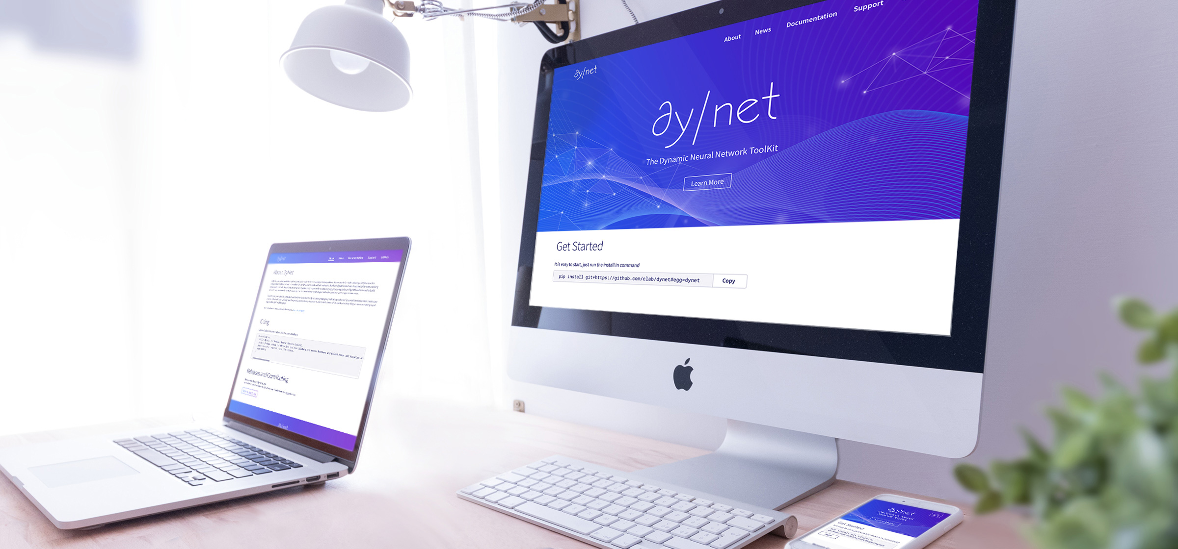
DyNet is a neural network library developed by Carnegie Mellon Univeristy and many others with high-performance. With the mature and popularity of DyNet, there is a need to provide people easy access to get start with DyNet and to learn more. I was asked by the DyNet creators to design a website for DyNet to better serve the machine learning community.
Goals
1. Make the contents organized and easy to follow
2. Convert the message that DyNet is a dynamic, reliable, efficient and easy to use library
3. The design of the website should be simple, flexible and easy to maintain
My Tasks
• Generate the site map and wireframes
• Prepare high-fedility mockups
• Generate graphic elements, including icons and other images needed
• Communicate with the developer to execute the design
• Assist the development work with some html/css and javascript
Challenges
• Understand the organize the comprehensive contents
• Visualize the abstract machine learning concepts
• Time intensive; all work need to be done within a week while I am also working on another major project
Workflow
Initial Kick Start Meeting
- Understand the goals, requirements and scope of the project
- Who: who will be the target audience of the website?
- Where: where will the website will be hosted; are there any technology limitations?
- What: what are the goals of the website; what are the contents to be shown;
- When: when the webstie need to be alive?
Site Map
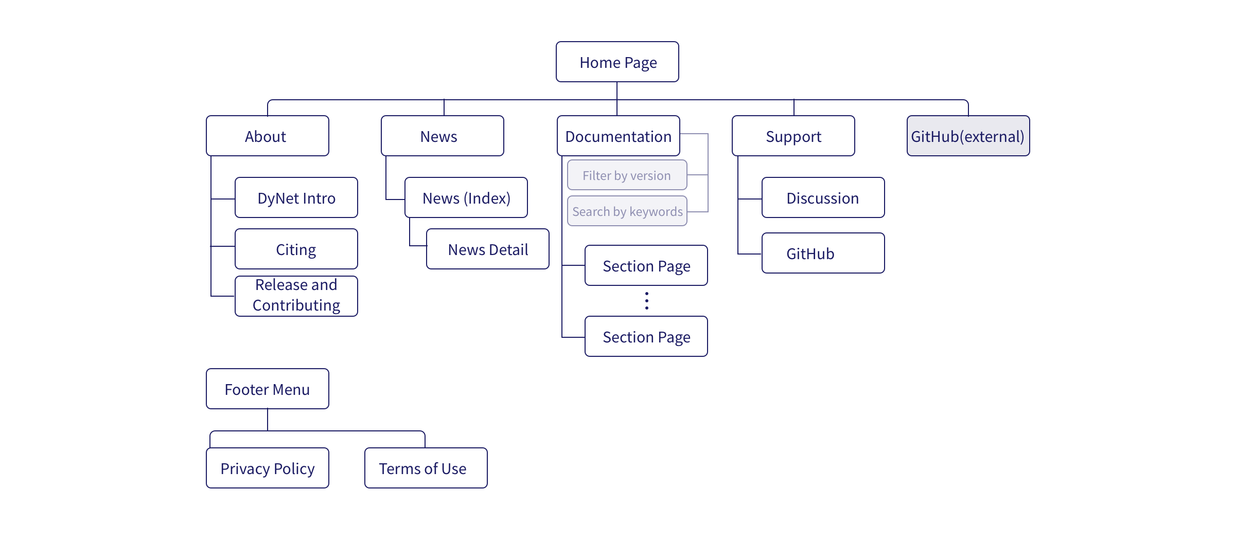
Based on the information provided during the meetings, site map was generated to organize the information and plan for buidling the web pages
Wireframes
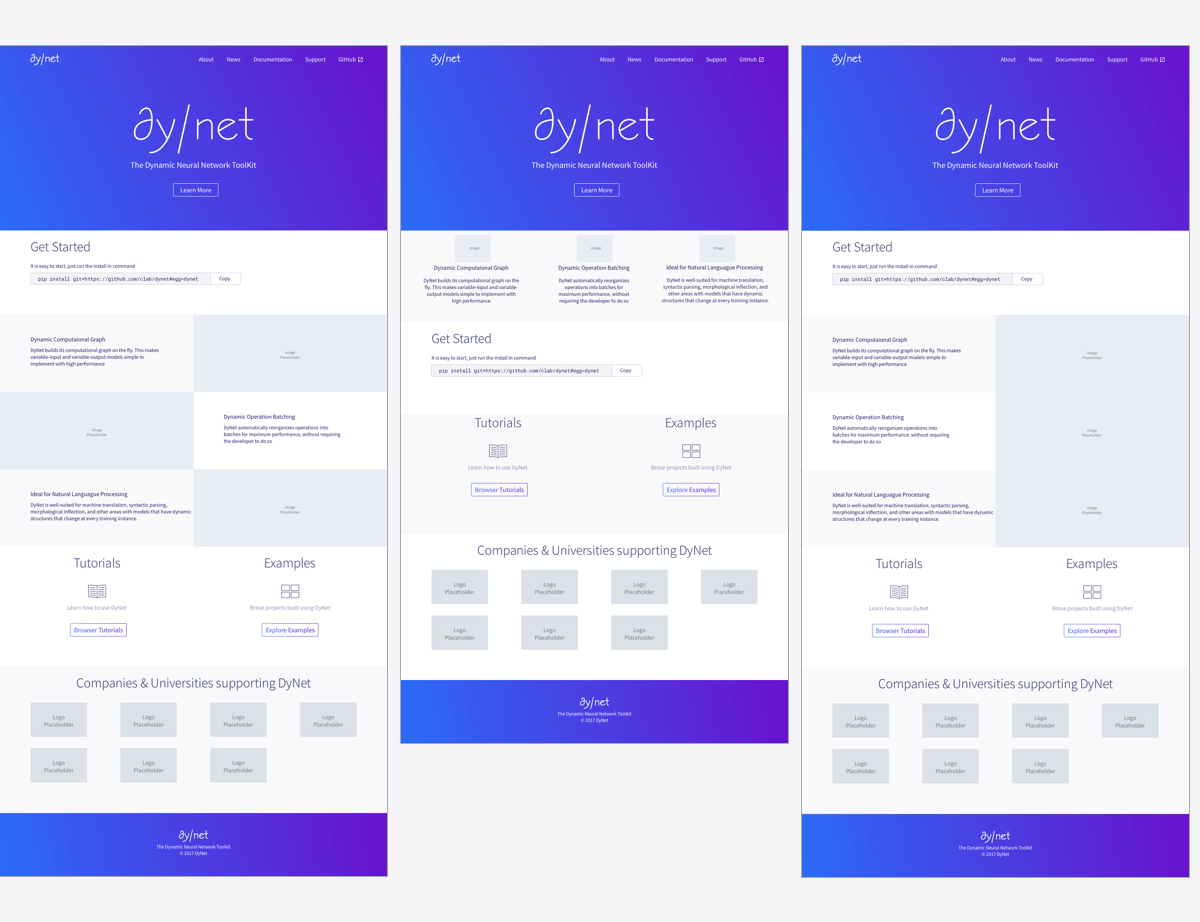
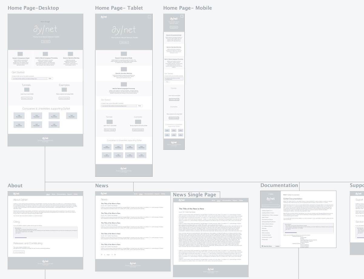
After I generated the initial wireframes based on the sitemap and other information provided by the team, meetings were scheduled to discuss about the pages and layout.
Set Page Layout & Development
After decided on the page layout and main interactions, developers start to create basic website without css styling based on the wireframe
Style Guide & Hi-Fi Mock Up
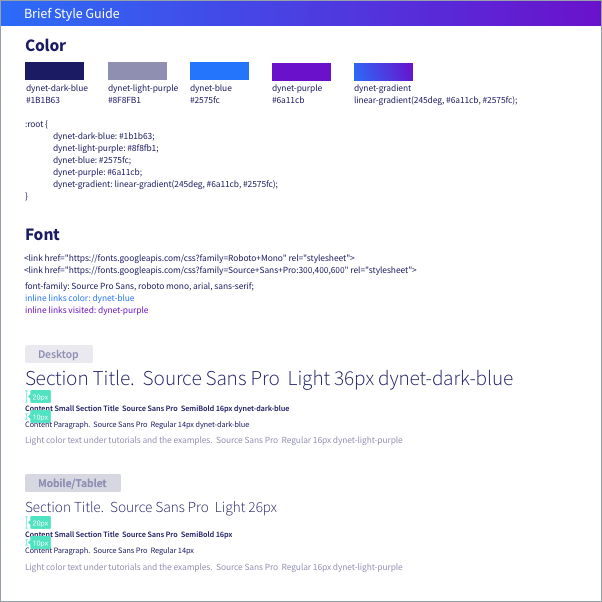
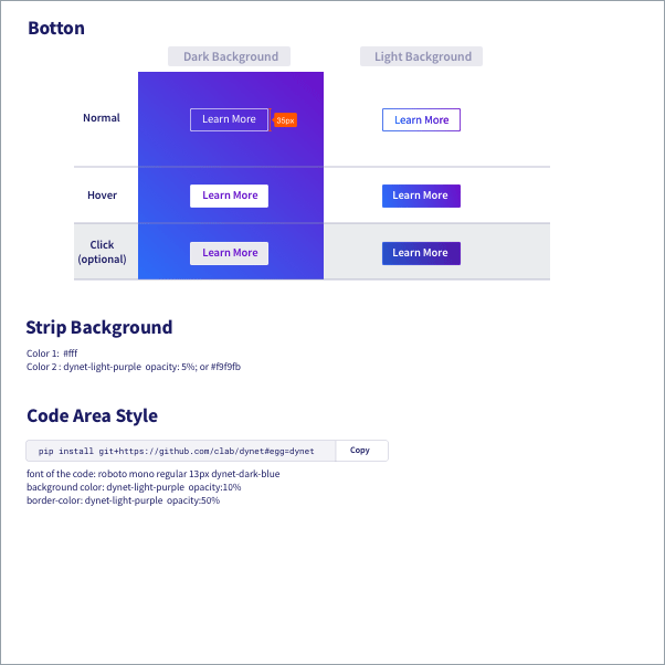
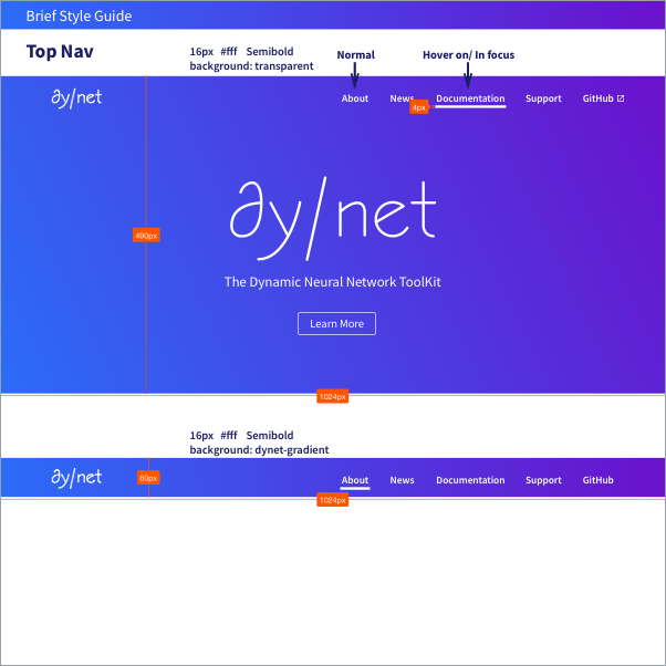
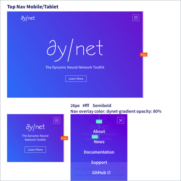
While the developer was working on setting up the basic layout, I worked on the styling and visual design of the website. After a few iterations, the final design style guide was provided to the developer together with Hi-Fi mock up. Due to the time restrain, only the major styles are provided.
Graphic Elements
While the developer was working on the styling of the website, I started to create graphic elements to replace the place-holder-images in the mock up. It was a challenge to create suitable graphic elements which not only just visually appealing, but also communicate the machine learning concept correctly.


The lines are representing the dynamic flows of data and running of the algorithms. The floating shapes are representing the dynamic operation batching, simliar things are grouped into batches to be processed in a more efficient way. Additionally, the image is designed to be seamlessly repeating vertically to make the life of the developer become easier when applying the image as background :- )
Results

Adjustments & Tuning & Reflection
During the process of design and development, lots of discussion and adjustments happened to make sure the website both fits the needs of users and and easy to be maintained. It was also a great opportunity for me to enhace my design skills to work under pressure and in a fast-speed environment. In this project, I have also learned how to communicate with developers more efficiently and provide necessary assistance to make the development work become easier.
