Data Machine is one of the fundamental parts of Petuum Symphony. It focuses on serving the users during the data exploration and preparation stage in a general machine learning process. I have been working closely with the engineering leads and product managers to explore, define and prioritize the different features of the Data Machine.
Behind the product, you will find me in the end-to-end design cycle: researching pain points, brainstorming ideas, mapping the work flows, wire framing and prototyping concepts, testing and gathering feedbacks for further iterations, and working with cross-functional teams on implementation. Here are a few case studies to showcase my work and thinking behind the design. Please don’t hesitate to reach out to hear more about it! ;- )
You can also go to Data Machine Overview to learn about the overall workflow within Data Machine and how it is designed to fit the needs from various user groups and how it connect with other building blocks in the end-to-end machine learning process within Petuum Symphony.
There are 3 case studies in this page:
- Case Study 1: Improve the data ingestion experience
- Case Study 2: Branching Out - Introduce more flexibility to data cleaning and transforming
- Case Study 3: Bring Up Data Visualization
Case Study 1: Improve the data ingestion experience
Data ingestion is the starting step of Data Machine workflow. Datasets could vary from one to another greatly in terms of the machine learning readiness. Therefore, users need to get a basic understanding about datasets before cleaning and transforming them.
In addition, there are many different use cases about how and when the users will ingest data into Data Machine. It is a challenge to facilitate users through the experience and to address on the different use cases at the same time. I have spent a good amount of efforts on researching the pain-points in data ingestion process, conducting design iterations and testing the changes.
Pain-points
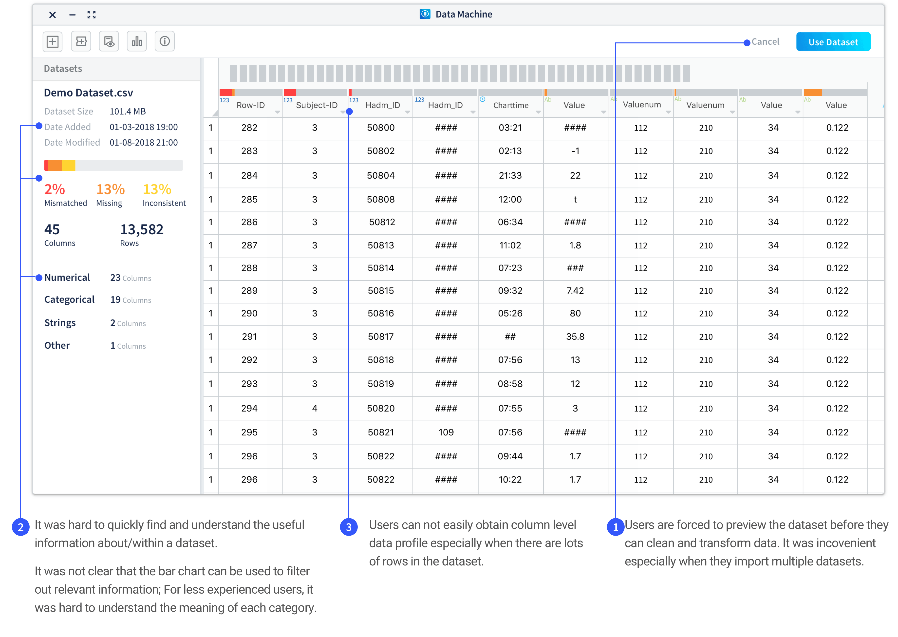
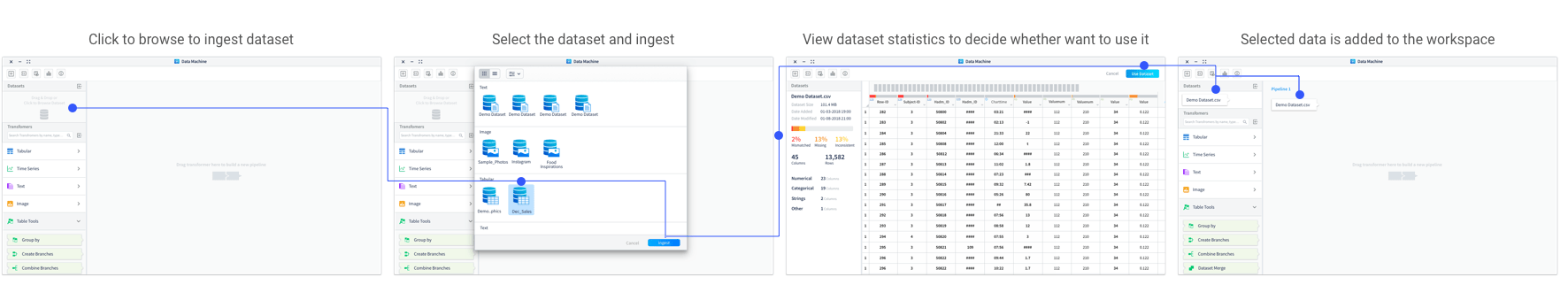
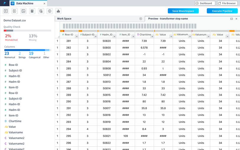
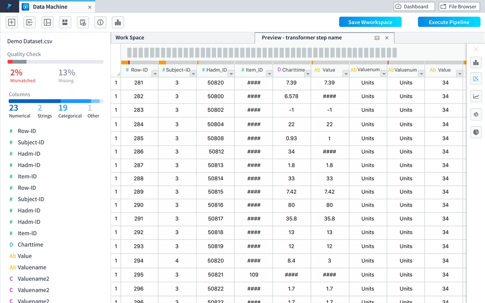
Improvement 1: Introduce more flexibility to users in terms of previewing the data during data ingestion process.
The data quality check and preview will be automatically available in a tab next to the main workspace tab when users ingest datasets. Users can choose to open the tab to view the information. Users can also keep working in the workspace while datasets are still under the ingestion process.
Reasoning Behind the Improvement
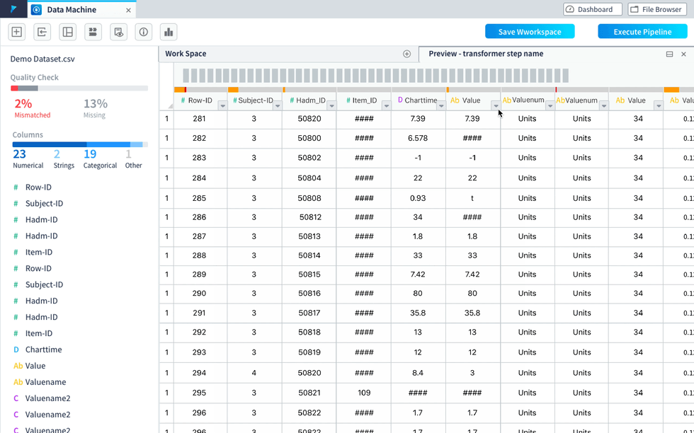
Getting a basic understanding on the datasets is important before users conducting data cleaning and transforming works. In the previous product workflow, users need to view the quality check and data preview of each dataset before they can ingest the dataset.
However, when observing the users using Data Machine after the first internal release, there are some pain-points identified through the data ingestion process:
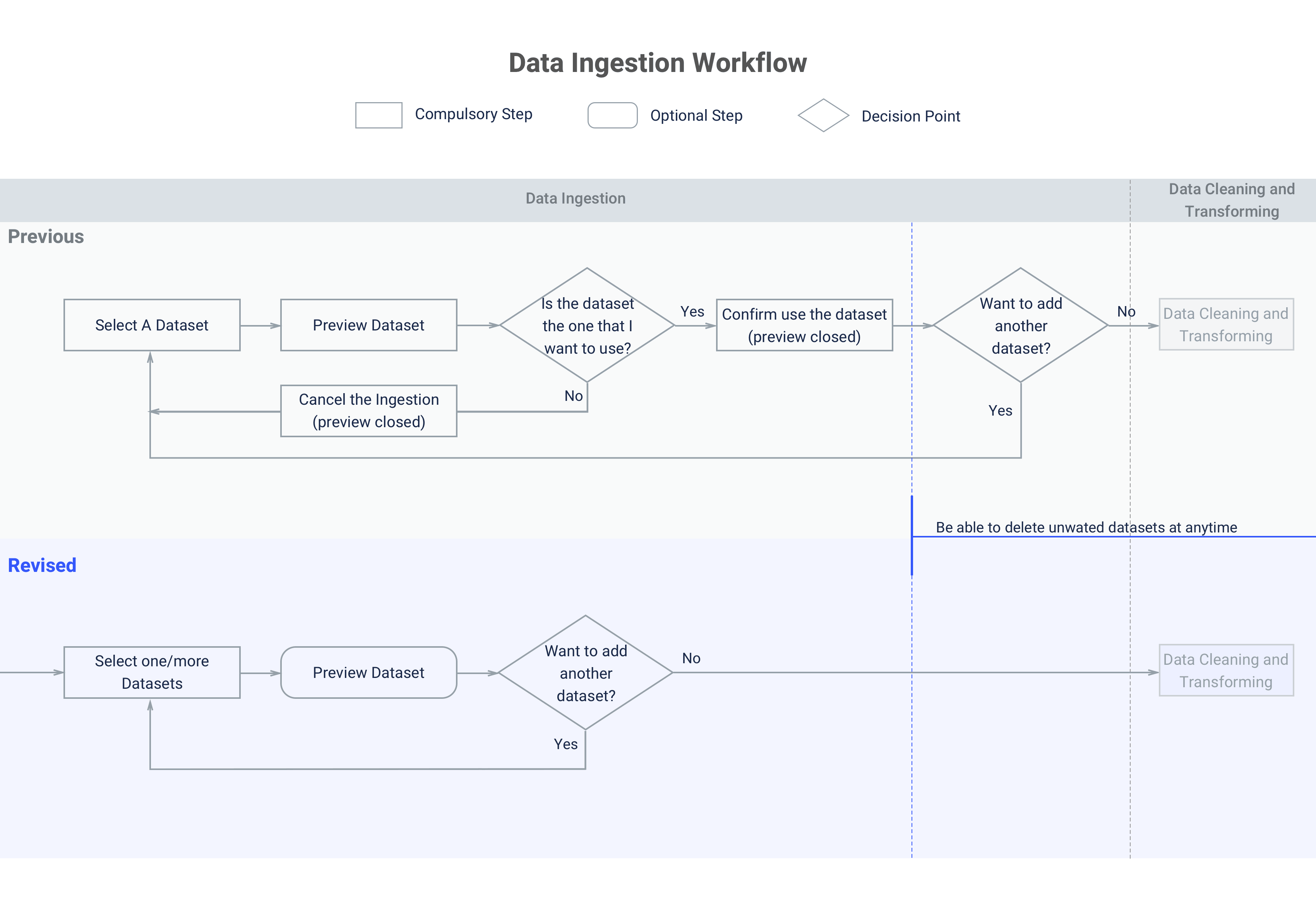
- It is not convenient for users to add multiple datasets.
- Showing data quality check and preview whenever a dataset being ingested could be overwhelming for user group with less data processing experience to cause unnecessary cognitive burden; while redundant for experienced machine learning experts who had already know about the datasets before using Data Machine.
- Ingesting datasets with tremendous size takes time and it could be annoying to wait until finishing ingestion before they can build data transforming pipeline.
Through the observation on how users use Data Machine, we realized that even though the users start engaging with the product from data ingestion, they do not necessarily start their work from there. We need to put users into working context to understand when and how they would use the services provided by Data Machine. In some use cases, by the time the users open Data Machine, they have already known about the basic info about the dataset and only want to directly interact with the data to try out different cleaning and transforming methods. Therefore, even though the knowing the data quality check and basic info is very important for conducting data transformation , it is not a step that user must to do it within Data Machine. The design improvements are done to make the workflow more friendly by really putting users into their working context to understand their needs and pain-points. Here is a comparison between previous and the simplified revised workflow(high level).
Improvement 2: Create hierarchy and introducing quick access to take actions on certain columns.
Create meaningful hierarchy to display dataset information
We worked with the data scientists to sort through the basic information needed about a dataset to cut off the unnecessary ones and reorganized the information to put them into a more organized way.
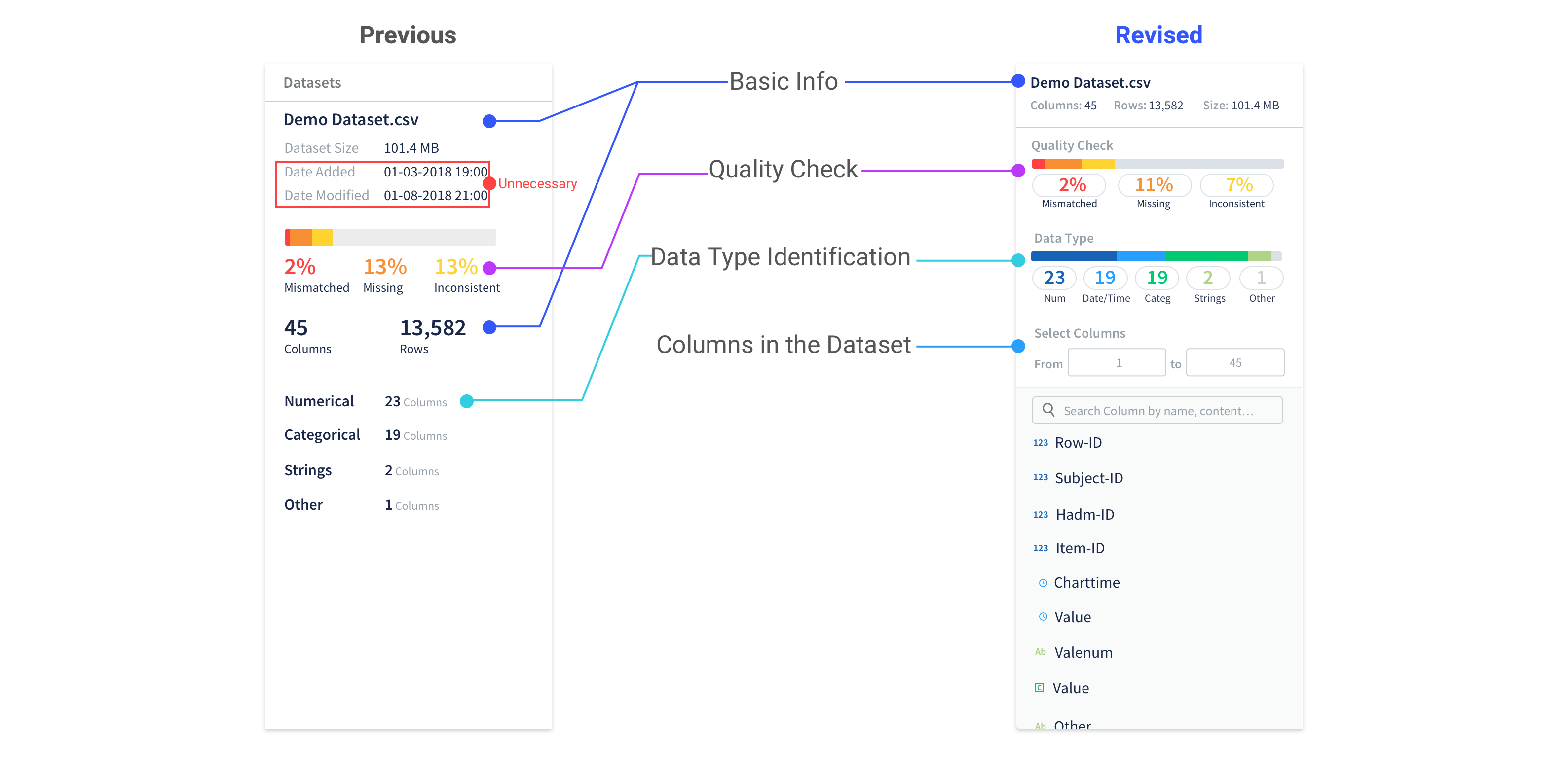
Provide visual cue
Provide visual cue to users that they can use the quality check and data type identification as filters to view selected columns.
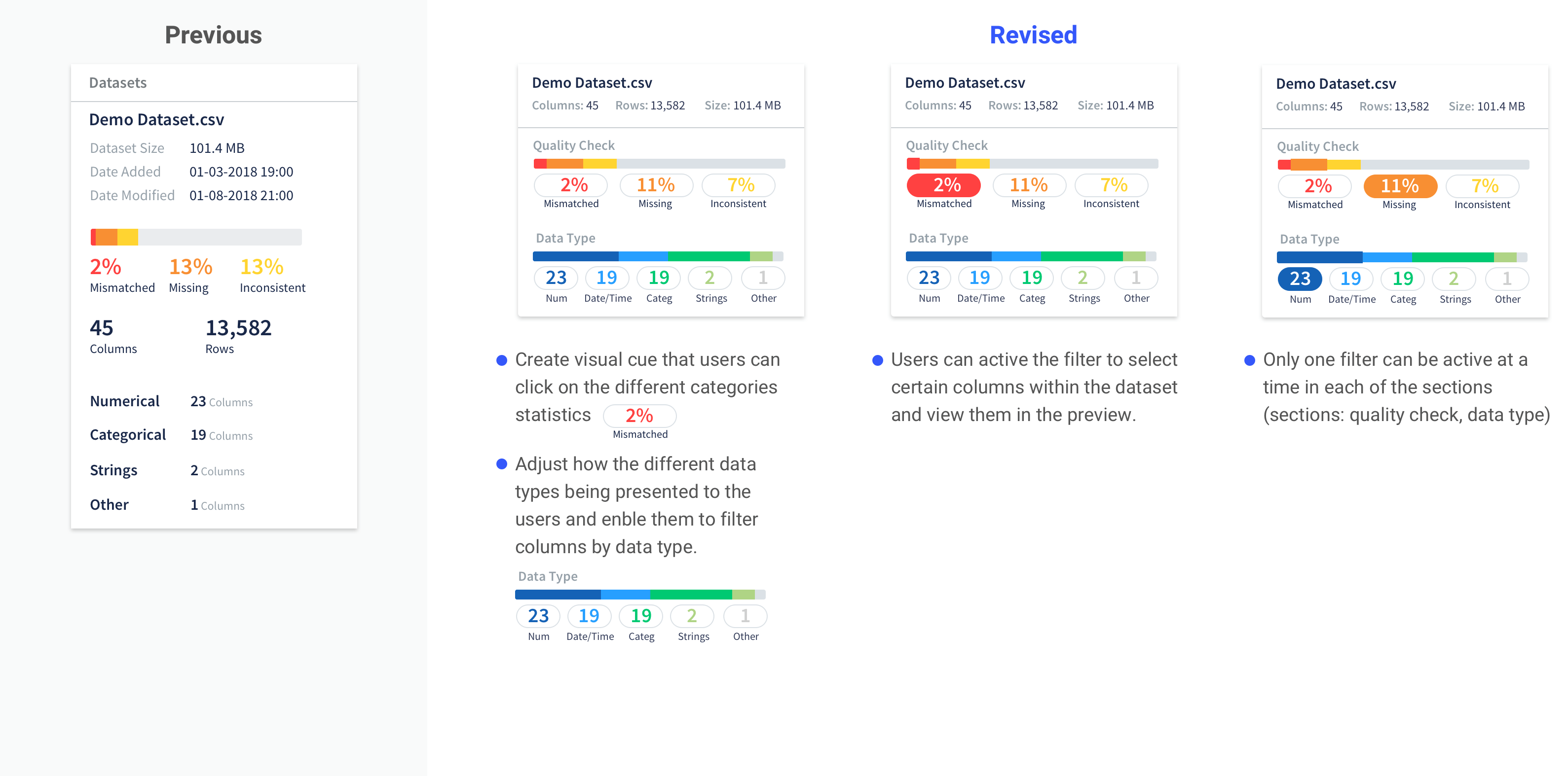
Work with the columns
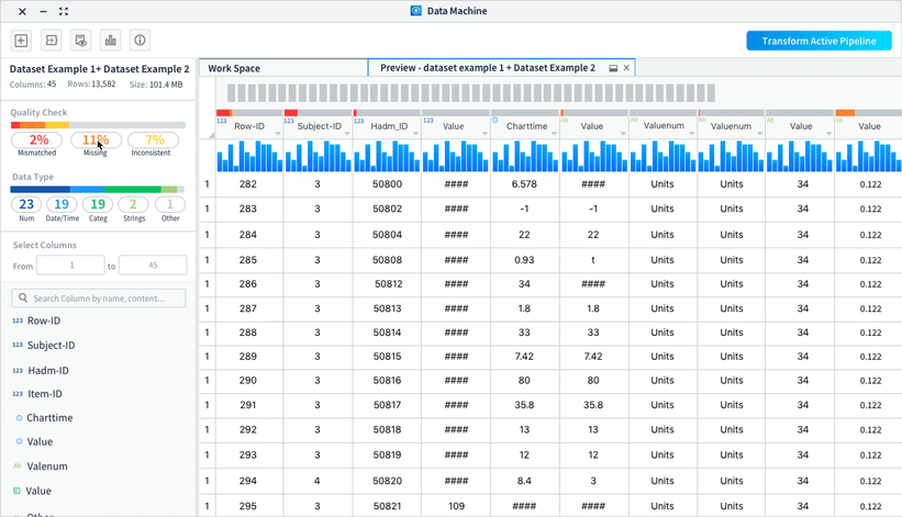
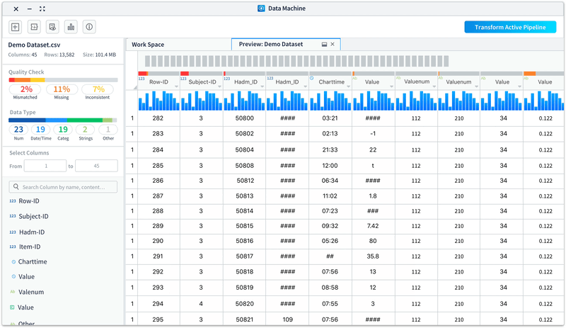
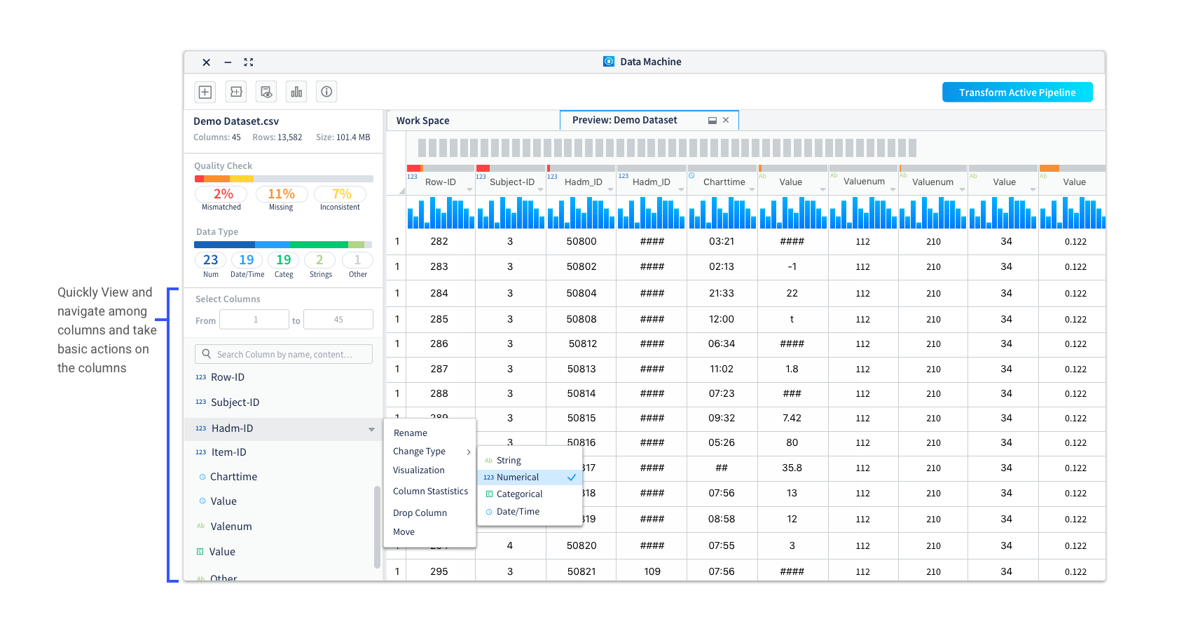
• List out the columns for users to easily glance through and take actions on the columns
• Enable users to view selected range of columns and search by column names/contents
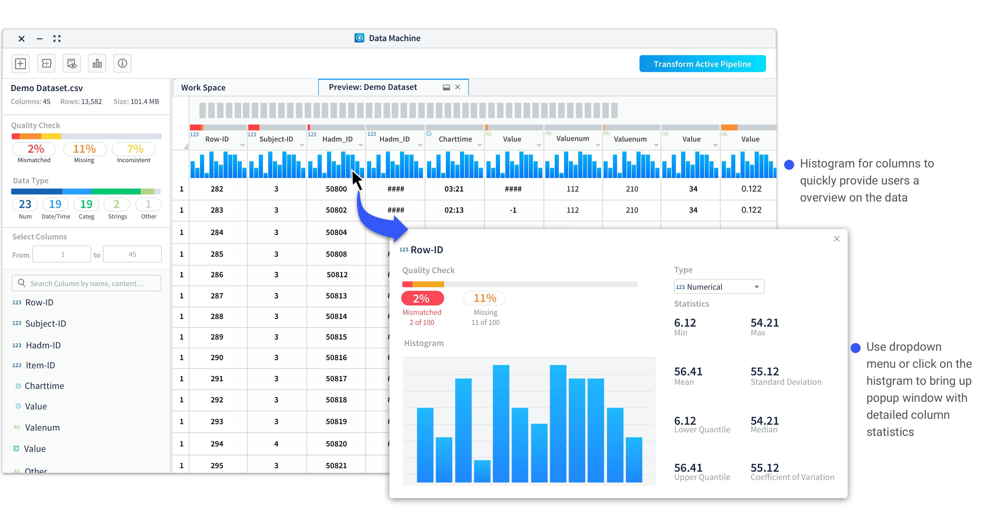
Improvement 3: Allow users to view column info visually with easy to access statistic info.
In usability testing of the data preview, one consistent feedback we got was users wanted to drill down to a specific column and check its statistical info. To help them better understand the data and provide column statistics, we introduced the histogram view to the preview.
Histograms are used to show distributions of variables for columns to help users get a better understanding on how the data is constructed and make better plans on how to clean and transform the data.

Case Study 2: Branching Out - Introduce more flexibility to data cleaning and transforming
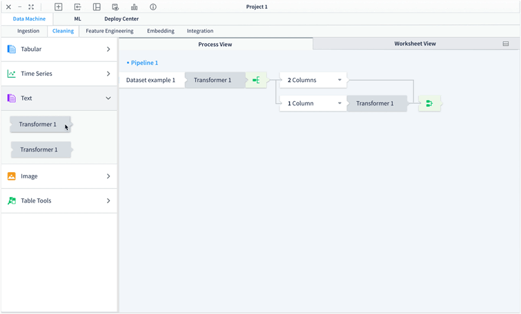
Another challenge we have when design Data Machine is: users sometimes need to apply different sets of transformation methods to certain parts of the dataset and may need to repeat or revise the applied transformation . To enable users to apply different transformation methods to selected groups of columns and to track what methods have been used easily, we introduced the branching out functionality into Data Machine.
Different options to create branches have been explored to best serve the users’ needs. Here are three of the previous options with pros and cons for each of them:
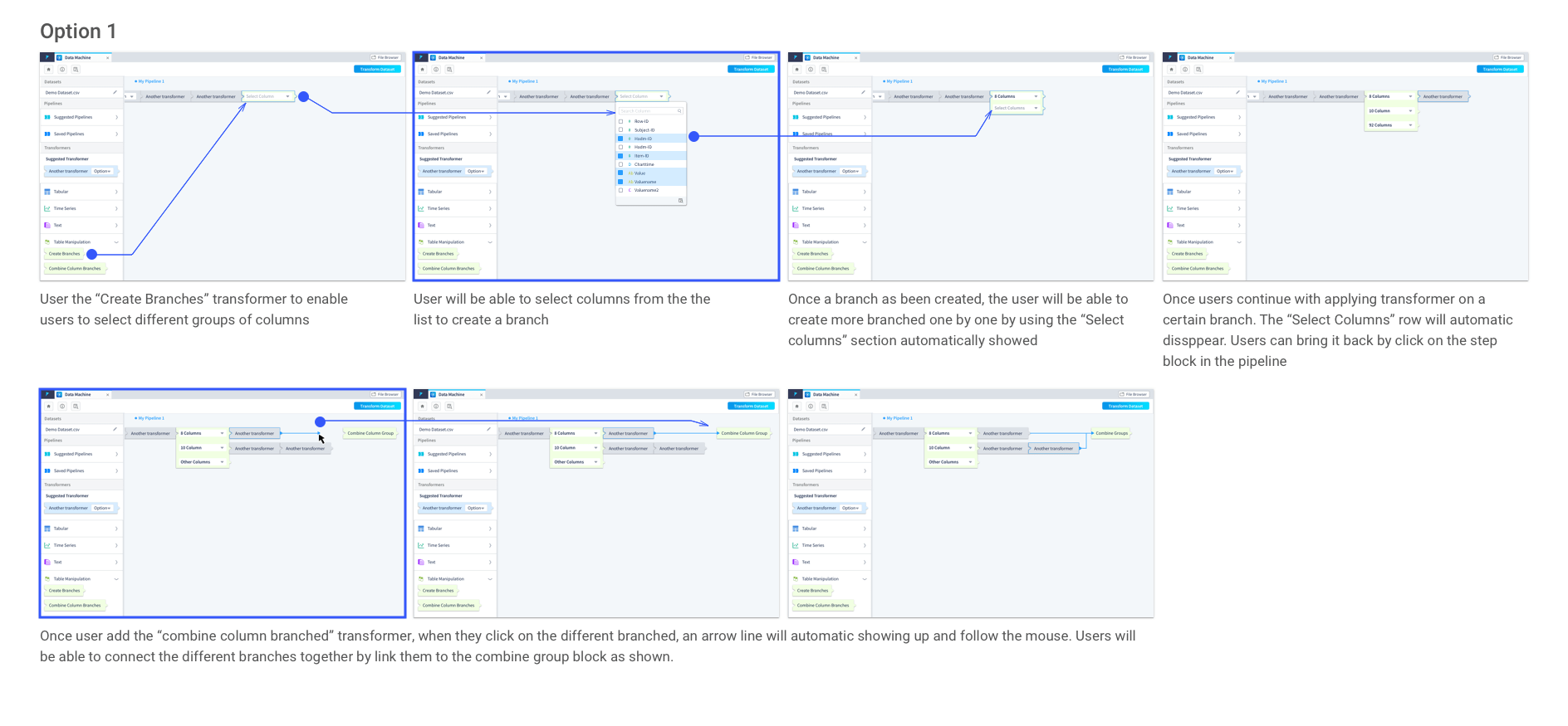
It is intuitive that users can create branches by selecting columns from a dropdown which directly locate on the transformer. However, when the dataset is large, it is hard for users to select the columns in a dropdown list. In addition, there is a need that users want to view the dataset when making the selections. Just the column names might not provide sufficient information to users. In this option, how to create and combine the branches are done in very different ways, it could lead to confusion to users.
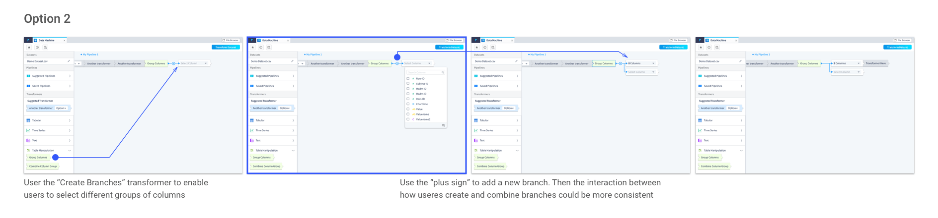
In this option, instead of automatically bringing up the new branch as a placeholder for the users until they decide to stop adding more branches, users need to click the “plus sign” to add a new branch. It makes the process of creating and combining branches more consistent.
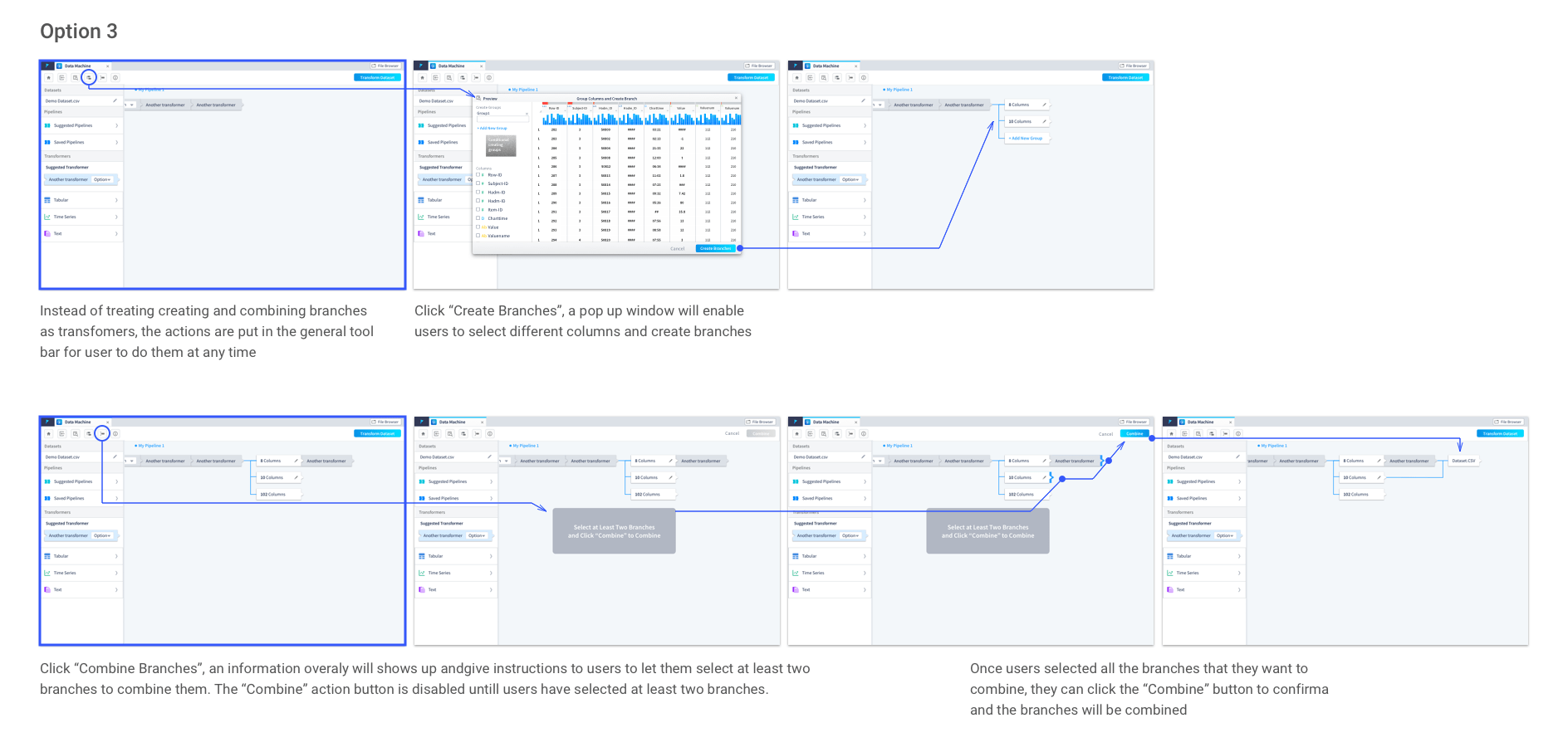
Instead of treating creating and combining branches as transformers, in this option, they are actions on the tool bar. Even though it works well here, it does not fit into the overall hierarchy of the building blocks in Data Machine. We have defined three main level of actions within Data Machine:
• cross stages general actions (e.g. create new workspace, pipeline, view saved pipelines, etc) put onto the top tool bar.
• dataset level actions (e.g. create and combine branches, merge dataset, join datasets, dataset transformations, etc) locate to the left panel as transformers.
• column level actions (sort column, delete column, column level transformations, etc) associate with the columns.
Case Study 3: Bring Up Data Visualization
Data visualization is important for users to get a better understanding on the data and to help them with deciding what transformations need to be added and what model should be chosen. Users need to be able to:
- view auto-generated data visualization based on what transformation actions have been taken
- adjust the auto-generated data visualization and create customized ones
- view the visualization and data transforming pipeline at the same time
I took the initiative to explore how data visualization can be brought out to best serve the user needs. First, I came up with several options and shared them with the team to get feedbacks; Then, I consolidated the feedbacks and explored more ideas. After rounds of design-feedback session and discussion with product managers on the features, a final version is selected.
Let’s take a look on the champion option!
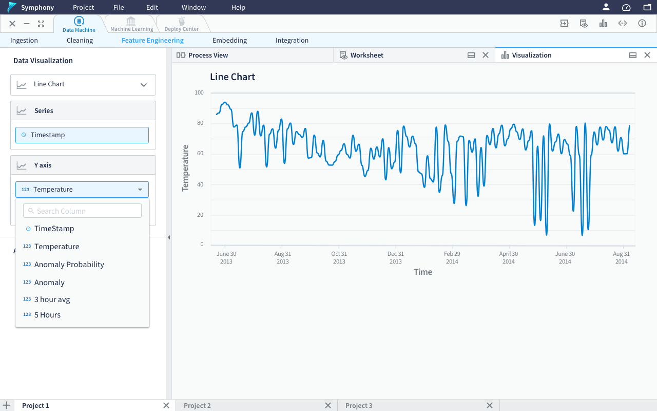
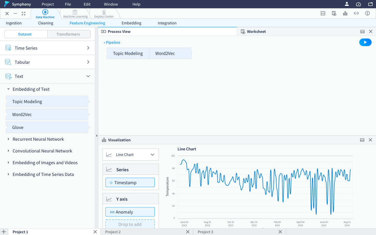
The Champion Option
Left panel - visualization control panel, where users can customize the data visualization when they open the visualization tab take the whole workspace.
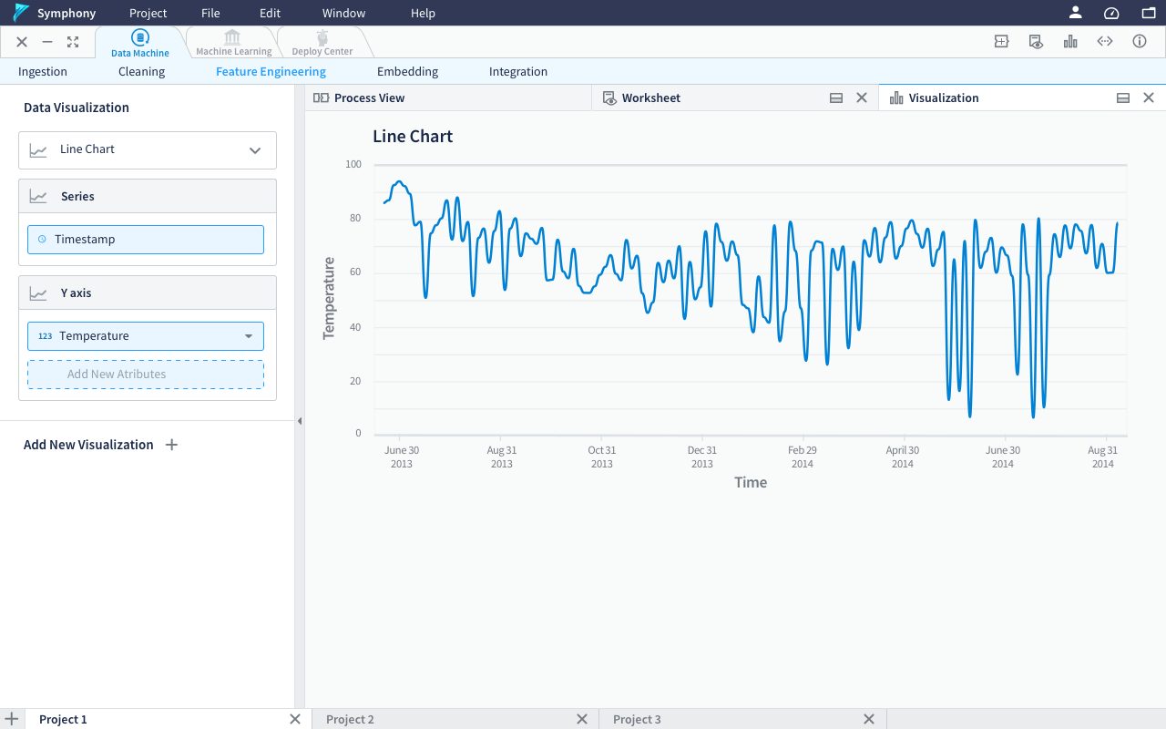
Using drop down to select column, with the search function available to quickly find the required column
The visualization tab can be docked to half to allow the users view pipeline/worksheet together with the visualization. When the visualization tab is docked to half, the left panel will be change back to the transformers to allow users continue building their pipeline.
Dragging out the tabs to allow them become separate windows(as shown in Option 4 below) is a good feature to have but that will introduce unnecessary confusion and complexity to the product, especially when there are multiple pipelines, datasets and projects. Therefore it is postponed to future product development cycles.
Previous Explorations
Option 1
visualization within the worksheet view(was called “preview”) as a panel pushing out.
Option 2
visualization as a separate window itself when use want to view data visualization. They can choose to keep it anywhere and anytime they want. Do not associate with the worksheet view.

Option 3 (By Giovanna during a feedback session)
Available visualization will be automatically shown an the right side as a pop up bar. When click it, the visualization bar will expand as a panel hovering on the workspace content.
Option 4
A visualization tab will be automatically added when the visualization is available after some transformation. Users can choose to set the visualization tab be half-screen and even become a separate window by dragging it out from the tab bar. This flexible layout makes it very easy for users to access the visualization in different use cases to achieve the same convenience.
To learn more about Data Machine, please don’t hesitate to reach out to hear more! ;- )