Ratings, reactions & profiles at IMDb
Designing three connected engagement experiences for one of the world's largest entertainment audiences — a new episode rating experience, video reactions, and the user profile — spanning responsive web and the native mobile apps.
Unlock the full case study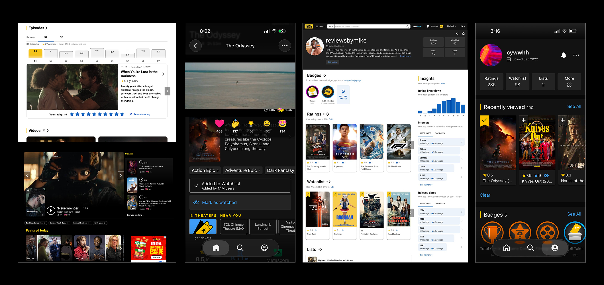
Overview
Hundreds of millions of people use IMDb to decide what to watch and to keep track of what they've seen. Ratings are the heart of that relationship, but the experience of expressing an opinion had grown uneven across surfaces. I worked on three connected experiences — episode ratings, video reactions and the user profile. The rating experience shipped on responsive web, while reactions and the profile were designed once and delivered natively across responsive web and the iOS/Android apps.
Beyond these features, I led the community perspective of the IMDb consumer experience: the vision for how IMDb builds and fosters active user engagement, and what a healthy, self-sustaining community around film and TV looks like at IMDb's scale. Ratings, reactions and the profile were each one expression of that broader vision.
Contact me to learn more about the vision beyond these three examples, and how I led the team toward it.
New Episode Rating Experience
Television dominates how people watch today, but rating behavior on IMDb skewed heavily toward whole titles: viewers finished an episode, had a strong opinion, and had no lightweight way to log it in the moment. Rating an episode meant navigating to that episode's page — several steps away from where viewers actually were.
- Episode-level rating volume trailed far behind title-level ratings, despite series dominating watch time
- The rating flow was optimized for movies, not for binge-watched series
- No momentum: rating one episode didn't invite rating the next
The redesigned experience brought rating to where viewers already were — the series page, season navigation and post-rating moments — with a flow that made rating consecutive episodes feel like one continuous gesture rather than repeated chores. It works inline on the series page without a page reload, and on a phone-sized screen the rating surface stays reachable with one thumb. Within two weeks of launch it drew 12.4K new rating actions per selected title and doubled the click-through rate for the rating campaign.
Try it live on IMDb — rate an episodeVideo Reactions
Trailers and clips are among IMDb's most-consumed content, but watching was a dead end: there was no lightweight way to respond to what you'd just seen. A full review is high effort; a star rating doesn't fit a 90-second trailer. The gap between "I feel something" and "I can express it" was where engagement leaked away.
Video reactions added an expressive, low-effort layer on top of the player — tuned separately for touch (reachable during full-screen playback without obscuring the video) and for web (discoverable without hijacking the viewing experience). The same reaction vocabulary carried across surfaces so the signal stayed meaningful in aggregate.
Try it live on IMDb — react to a videoChoosing a Reaction Set That Reads Globally
The open question wasn't the interaction — it was the vocabulary. I mined existing comments and reviews on trailers and clips, paired with dedicated research, to shortlist the emotions that came up most consistently across audiences, rather than guessing from an internal list. From there, I worked with a motion designer to translate that shortlist into an emoji set built for cultural legibility — an expression can read as clearly positive in one market and ambiguous in another. Candidates went through rounds of user validation testing not just "do you like this icon" but "does everyone agree on what it means."
Validating and Iterating with Experiments
A reaction set is easy to ship and hard to undo — once people form the habit, changing the vocabulary resets it. So candidate sets, placements and entry points were run as experiments and judged on actual usage and clarity, not stated preference, before any default was locked in.
Making Reactions Work Everywhere
The harder half of this feature was never the icon — it was making the reaction layer disappear into every context it had to live in, across trailers, clips and full episodes at every aspect ratio, player layout and screen size.
- Built placement rules, not fixed positions, so reactions stayed reachable without breaking at any screen size
- Treated "does this ever cover the content" as launch-blocking, not a polish pass — including full-screen playback
- Reserved space for streaming-partner watermarks so the reaction UI could never overlap a required on-screen mark
- Tuned motion and density separately for touch and pointer, so it felt native on both phone and desktop
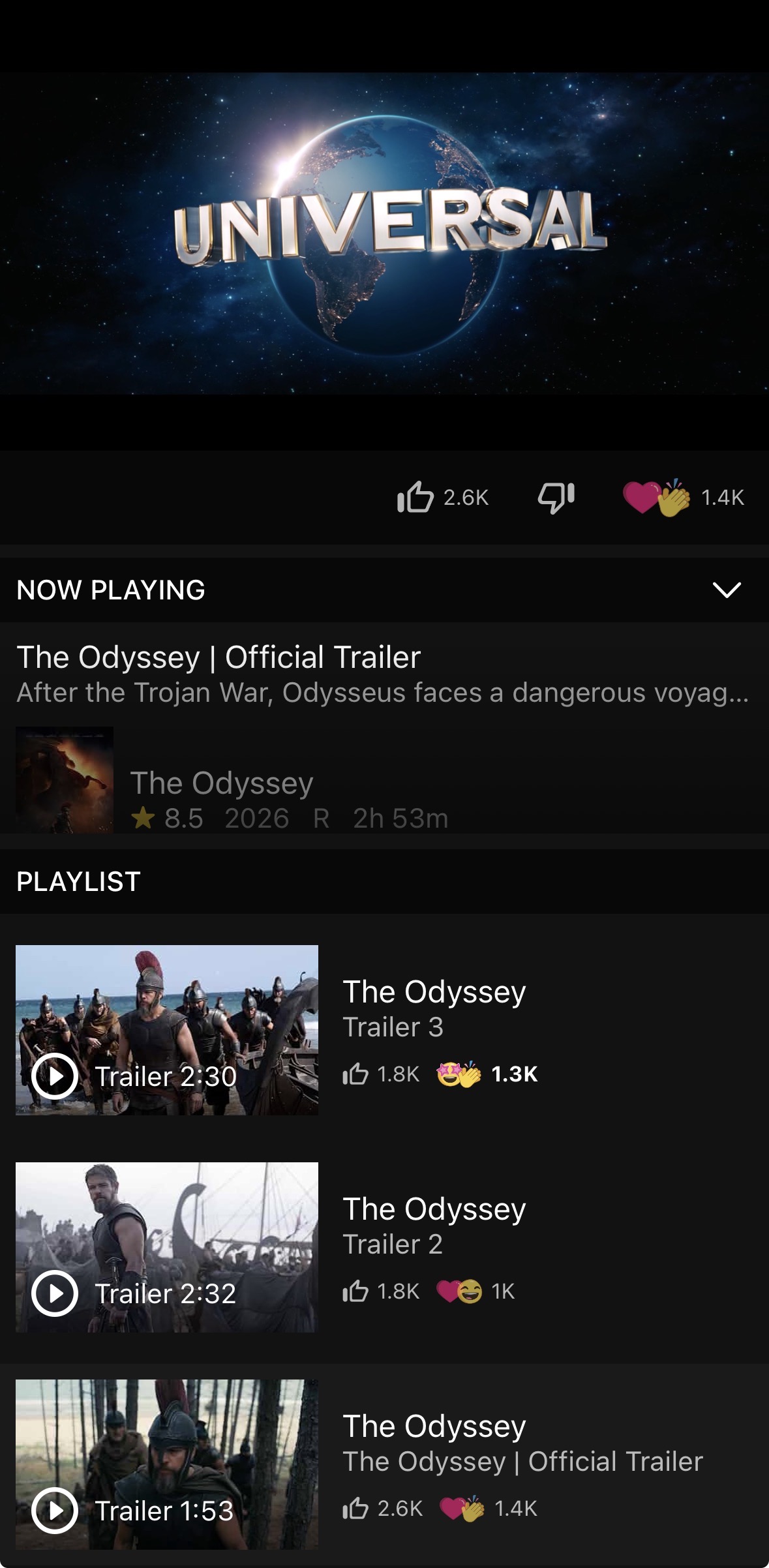
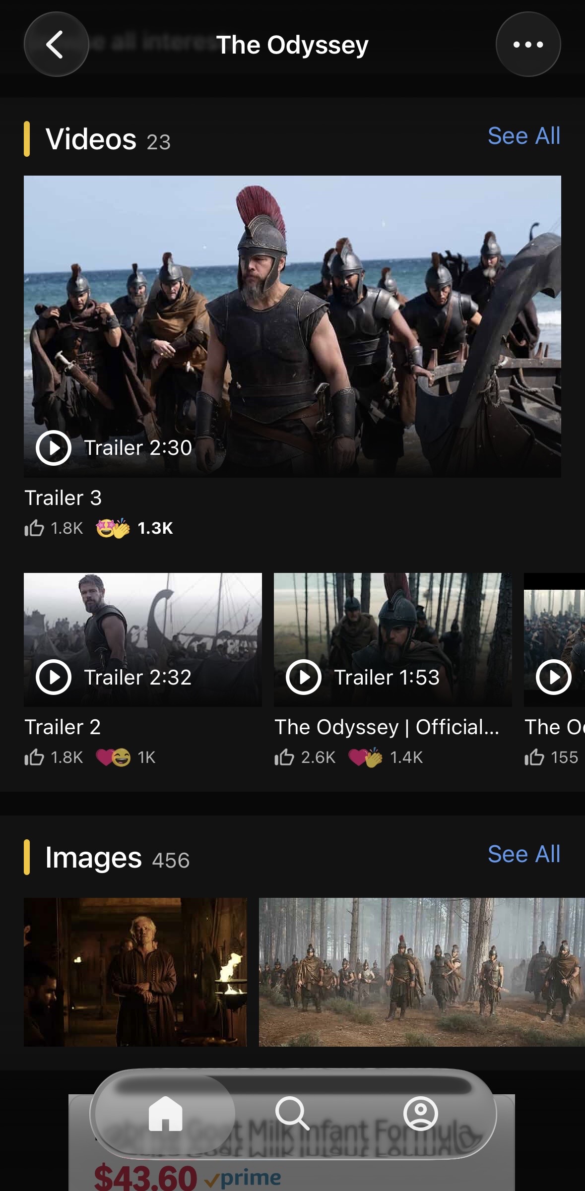
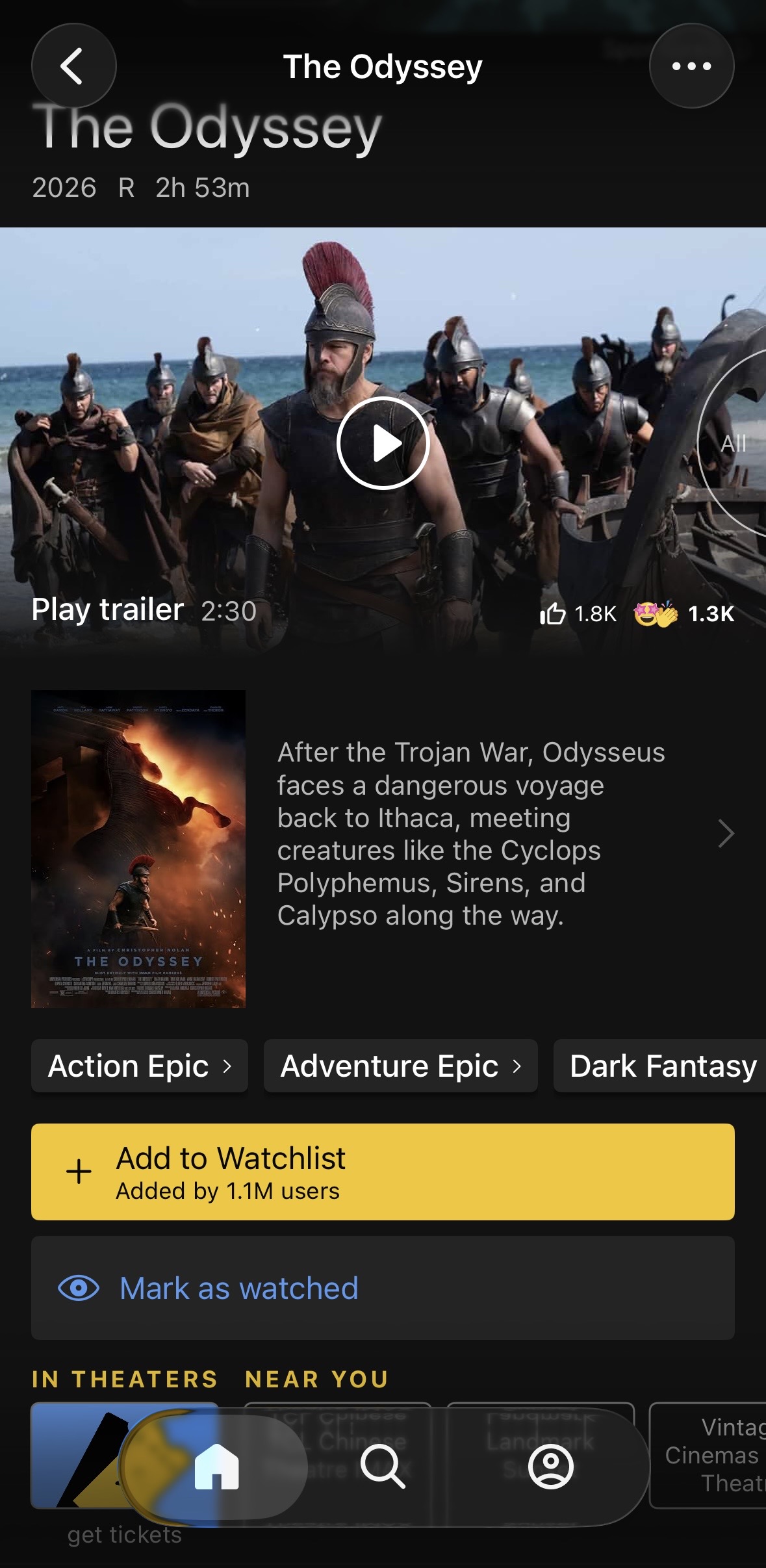
Reactions gave the video library a signal it never had: a lightweight response people would actually leave, aggregated into counts that now sit beside every trailer and clip and help the next viewer decide what to watch. Members who reacted proved more likely to come back and keep responding — the low-effort action turned out to be a first step into contributing rather than an end in itself.
User Profile Experience
All of this activity — ratings, reactions, watchlists, reviews — needed a home. The existing profile was a utility page: a place where lists lived, not a place that reflected who you are as a viewer. As engagement features grew, the profile had to become the connective tissue that makes contributing feel worthwhile.
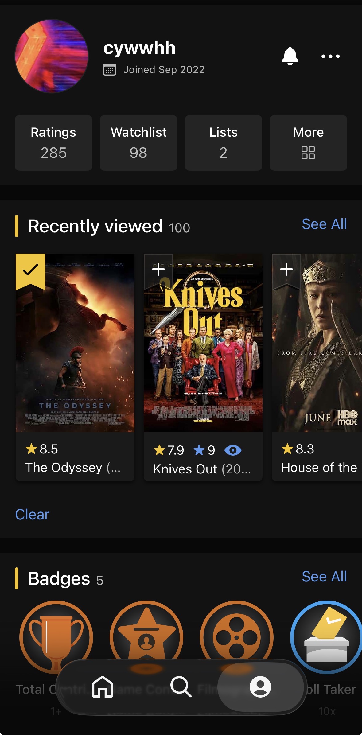
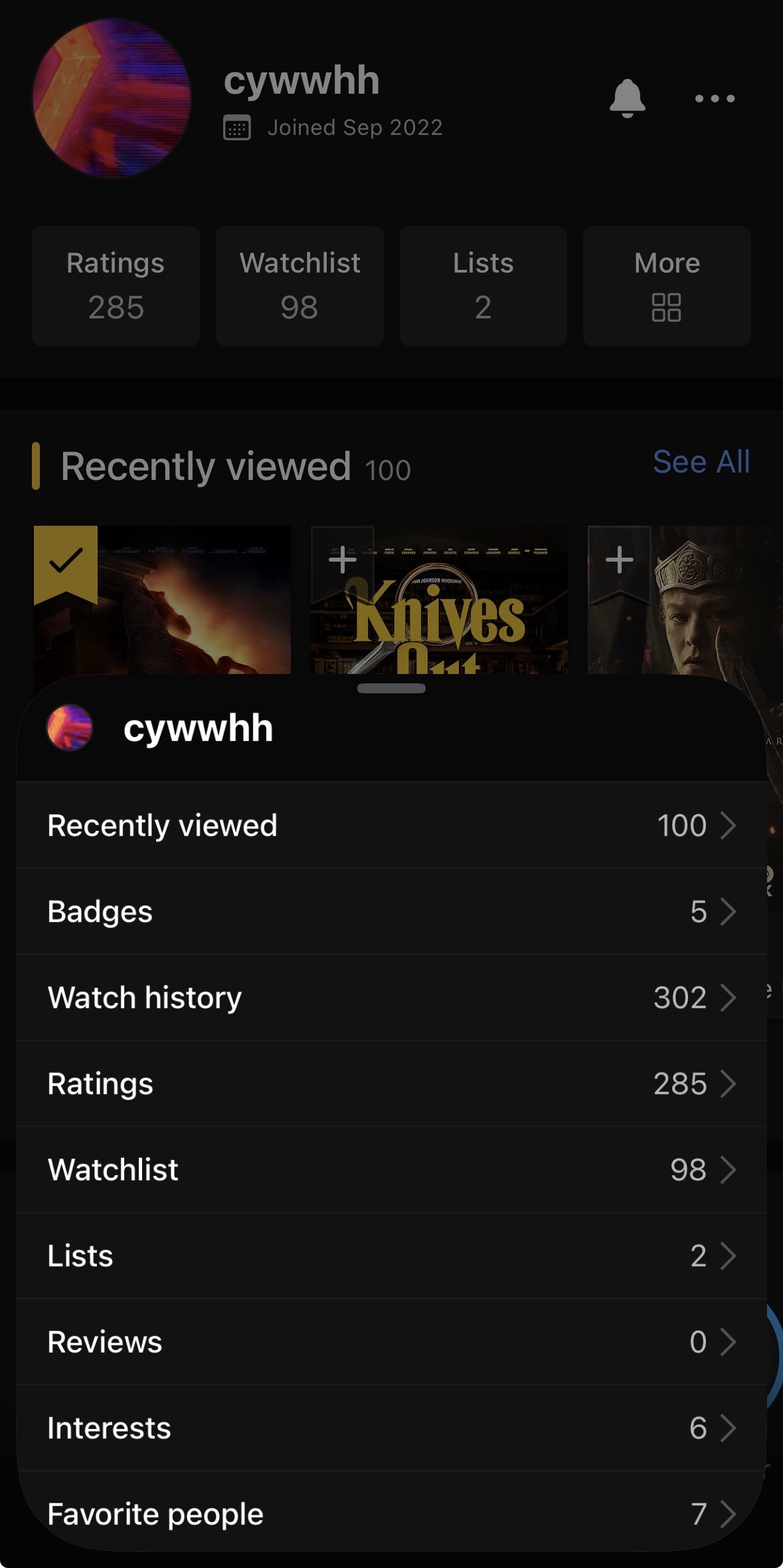
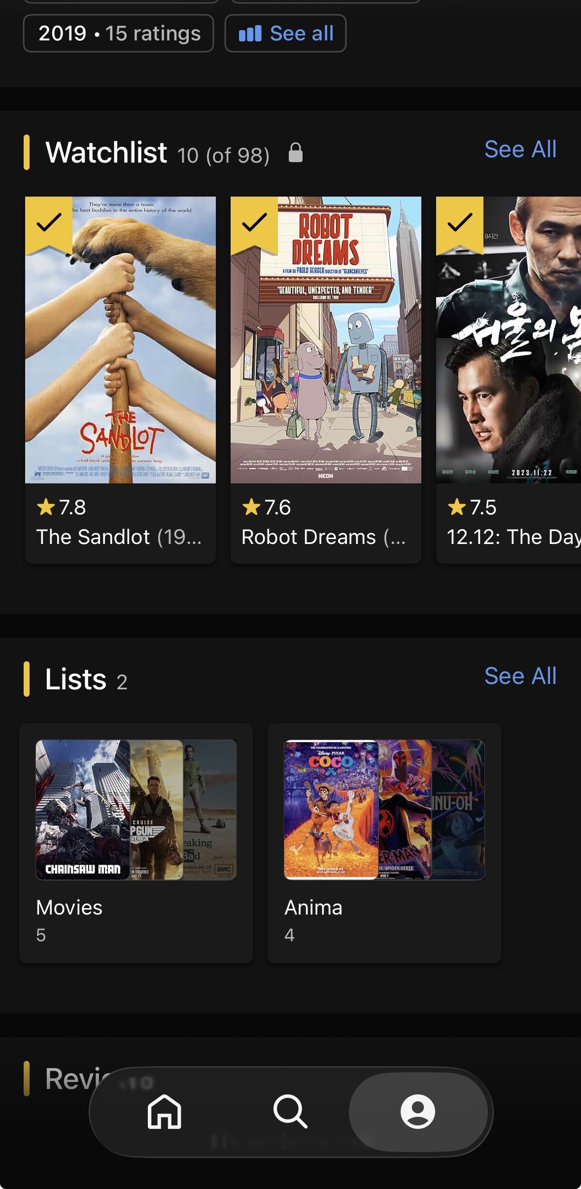
The redesigned profile organized a member's activity into a coherent, browsable identity — what you've rated, what you're watching, what you've reacted to — consistent across responsive web and the apps, while respecting each platform's navigation patterns. It also created a natural feedback loop: the more you contribute, the more useful and personal your profile becomes.
One Profile, Every Screen
The profile had to work as one coherent design across responsive web, iOS and Android, at phone and tablet sizes — not a web layout stretched onto mobile or an app pattern bolted onto the browser. Each platform got its own navigation and information density while keeping the same underlying structure, so a member's profile felt like the same place no matter where they landed.
The harder tension was audience, not screen size: a new member with a handful of ratings and a power user with thousands needed the same page to feel welcoming to one and useful to the other. Empty and light states had to invite a new user to start contributing, while dense states for veteran users stayed organized and scannable rather than overwhelming.
Scoping What Belongs on a Profile
Beyond just displaying activity, the profile added insights back to members about their own behavior — patterns in what they rate and watch — and options to customize what showed and to whom. Social features that encouraged connections between members were also explored, on the logic that a profile becomes more valuable when other people can see it.
Not everything made the cut. Some social and customization ideas were scoped down or dropped, either because of technical constraints or because they opened the door to abuse — anything encouraging visibility between members was weighed against the risk of harassment or unwanted contact before it was allowed to ship.
The profile turned scattered activity into somewhere a member could see themselves: ratings, watchlist, lists and badges gathered in one place, with insights that reflected their own taste back at them. Giving contributions a home made contributing more rewarding — the profile became a reason to keep rating rather than just a record of having done so.
Learnings
Engagement at consumer scale is an exercise in restraint, and restraint is an organizational discipline before it's a visual one: every new surface competes with the core reason people came — to look something up. The durable move was establishing a shared principle the whole team could prioritize against — meet people in the moment of feeling something (finishing an episode, watching a trailer) rather than asking them to go somewhere and do work — which gave three separate feature efforts one coherent engagement model instead of three competing ones.
Shipping across responsive web and native apps in parallel also forced a system-level discipline: design the behavior once, then let each platform express it natively. That framing turned cross-platform consistency from a per-screen negotiation into a default the team could scale.
Want the full story?
The complete case study — including the community vision reel — is available with a password. Don't have it? Get in touch.
Unlock the full case study